Design Focus
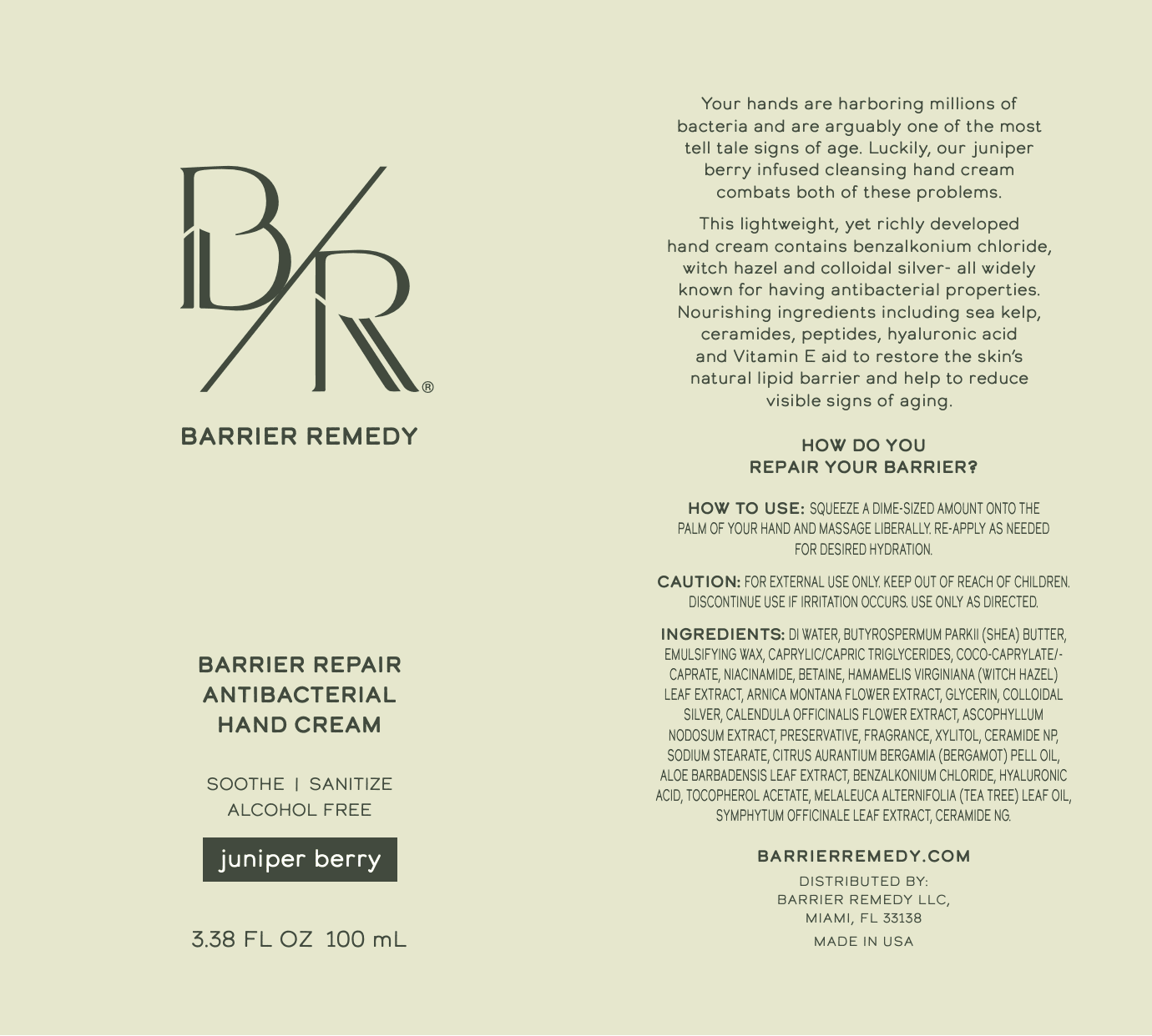
Develop a calm, trustworthy visual identity for a hand cream brand focused on skin barrier care. The goal was to create a logo, packaging, and supporting visual assets that communicate protection, hydration, and everyday usability while feeling modern and approachable.


Brand Identity and Logo
Designed a minimal, balanced logo that reflects care, reliability, and skin first sensibility. The mark was created to feel gentle and confident, supporting a brand centered on barrier repair and daily use.
Packaging Clarity
Established a clean packaging layout with clear hierarchy and restrained typography, allowing the product purpose to be easily understood at a glance without visual noise.
Visual Asset System
Created supporting visual assets that extend the brand across digital and marketing touchpoints. The system maintains consistency through typography, spacing, and color, reinforcing a cohesive and recognizable brand presence.

The final brand and packaging system presents Barrier Remedy as calm, credible, and intentional. The design supports clear communication of product purpose while creating a cohesive visual language that scales across packaging and brand assets.
This project highlighted the importance of simplicity and trust when designing for skin care. By focusing on restraint, clarity, and consistency, the final identity allows the product and its purpose to lead, creating a brand that feels approachable, reliable, and built for everyday use.
Website:


