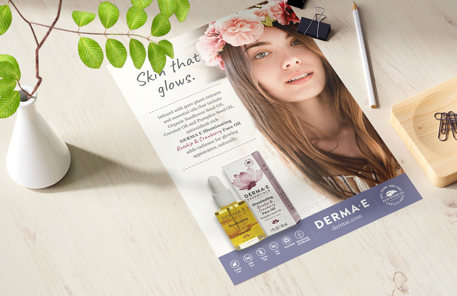
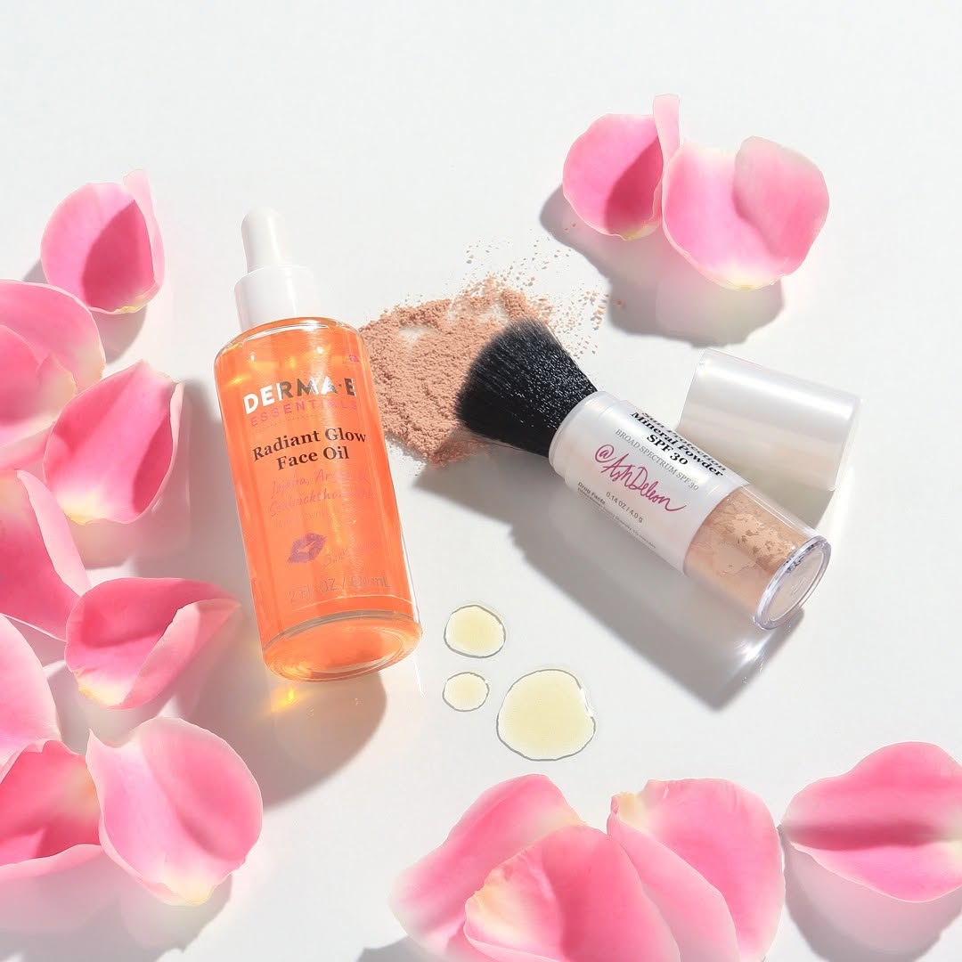
Design Focus
Refresh an outdated packaging system to improve clarity and consistency, while supporting new product additions within the existing brand.
Before: The existing packaging relied on heavy color blocking and dated visual elements, resulting in a crowded appearance and inconsistent hierarchy across the line. While functional, the design lacked clarity and a modern aesthetic, making it difficult for products and collections to feel cohesive on shelf.
After: The redesigned packaging introduces a cleaner, more modern visual system centered on white space, refined typography, and a simplified color strategy. Color is used more intentionally to differentiate collections, while improved hierarchy and consistency create a fresh, cohesive look that feels contemporary, elevated, and easier to navigate for the consumer.


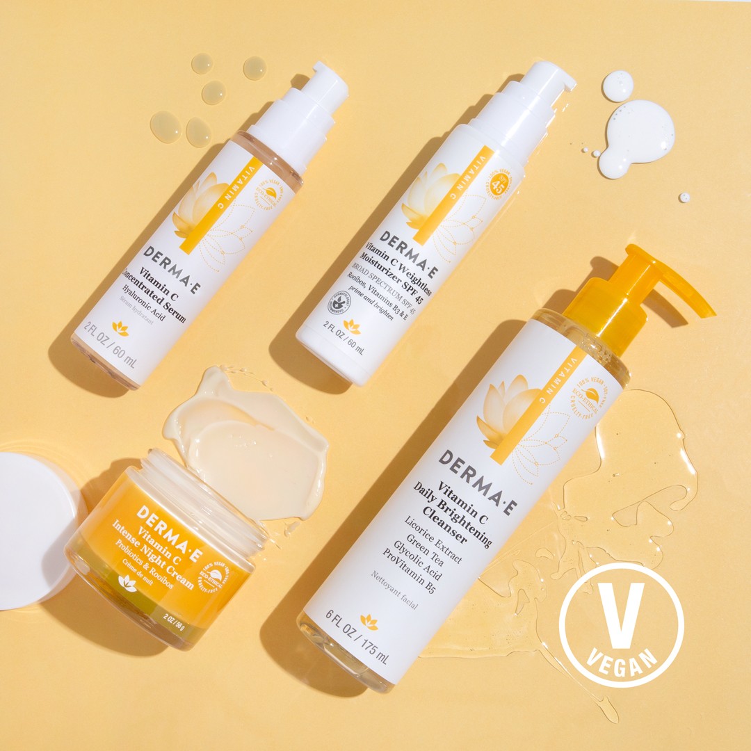

The final system was designed to support long-term scalability, allowing new products to be introduced seamlessly while maintaining consistency across the brand.