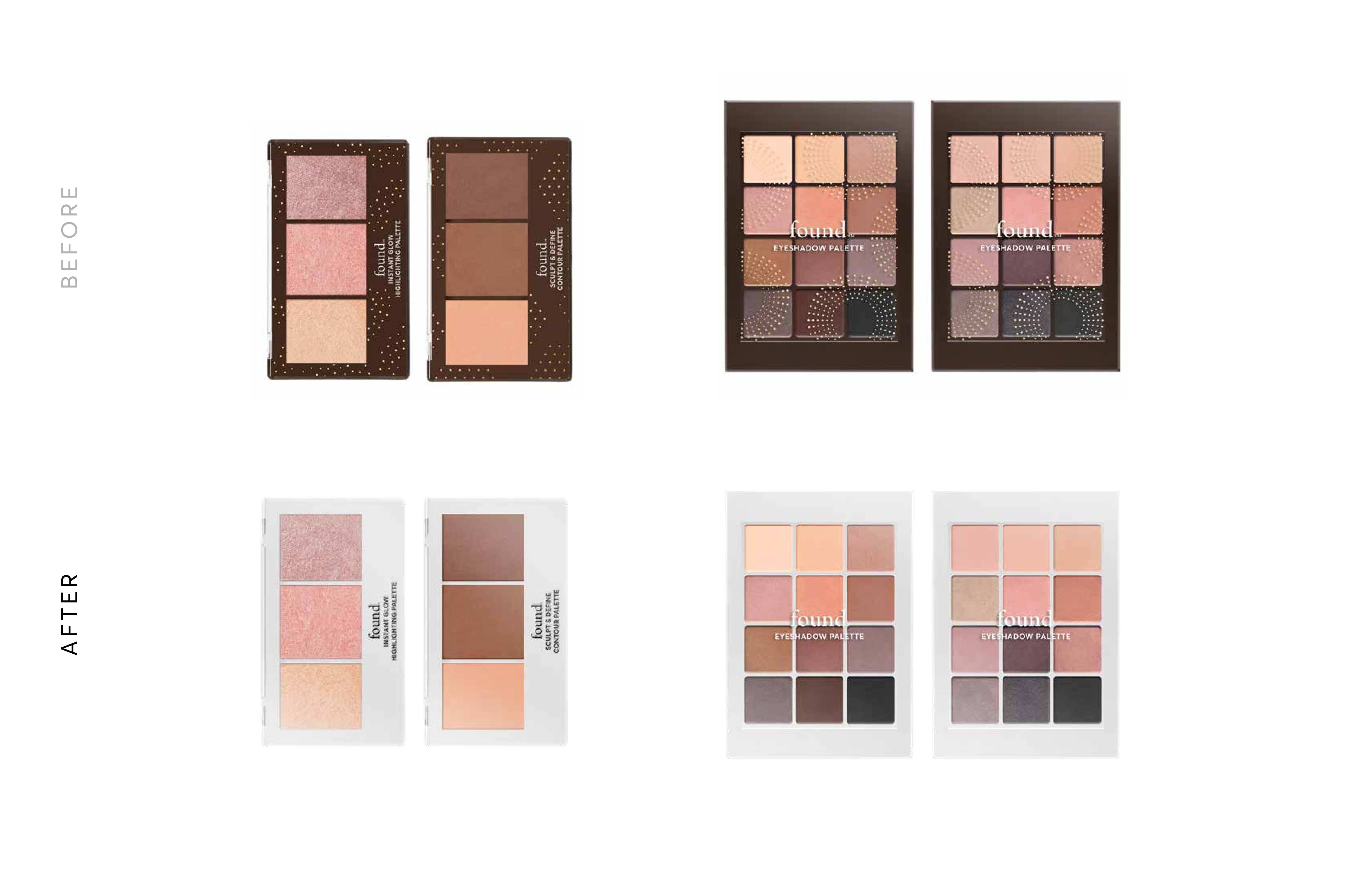
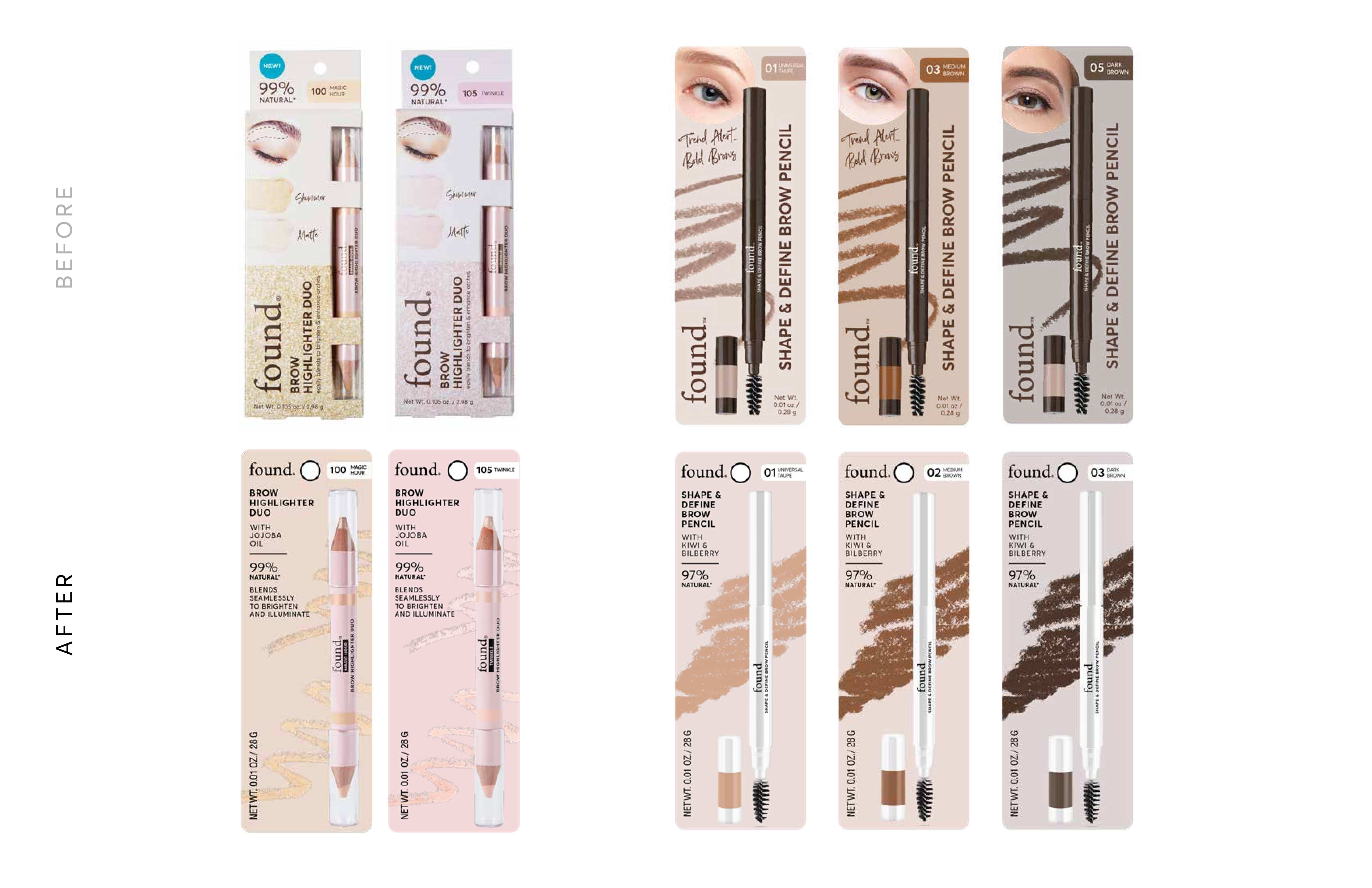
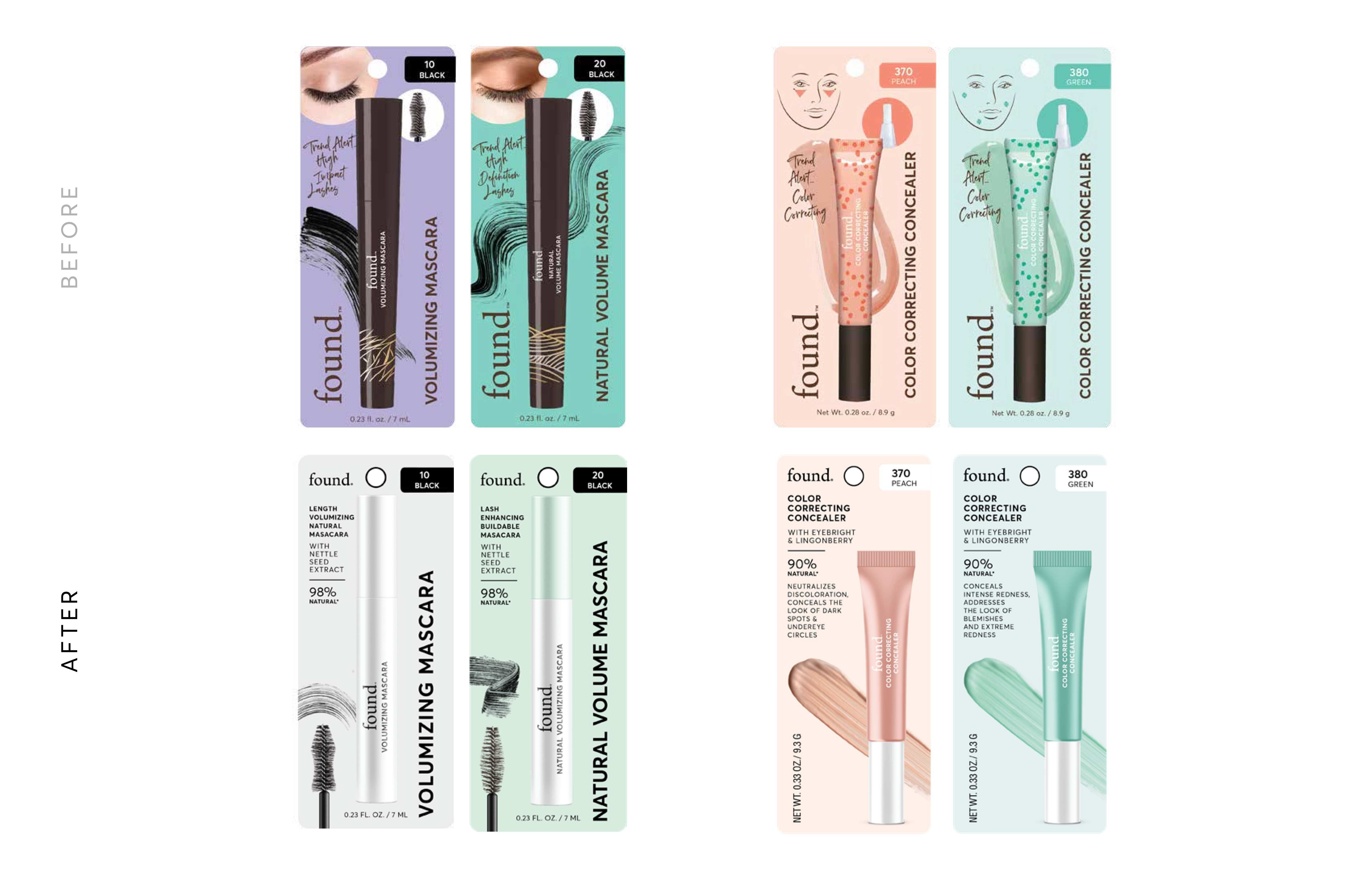
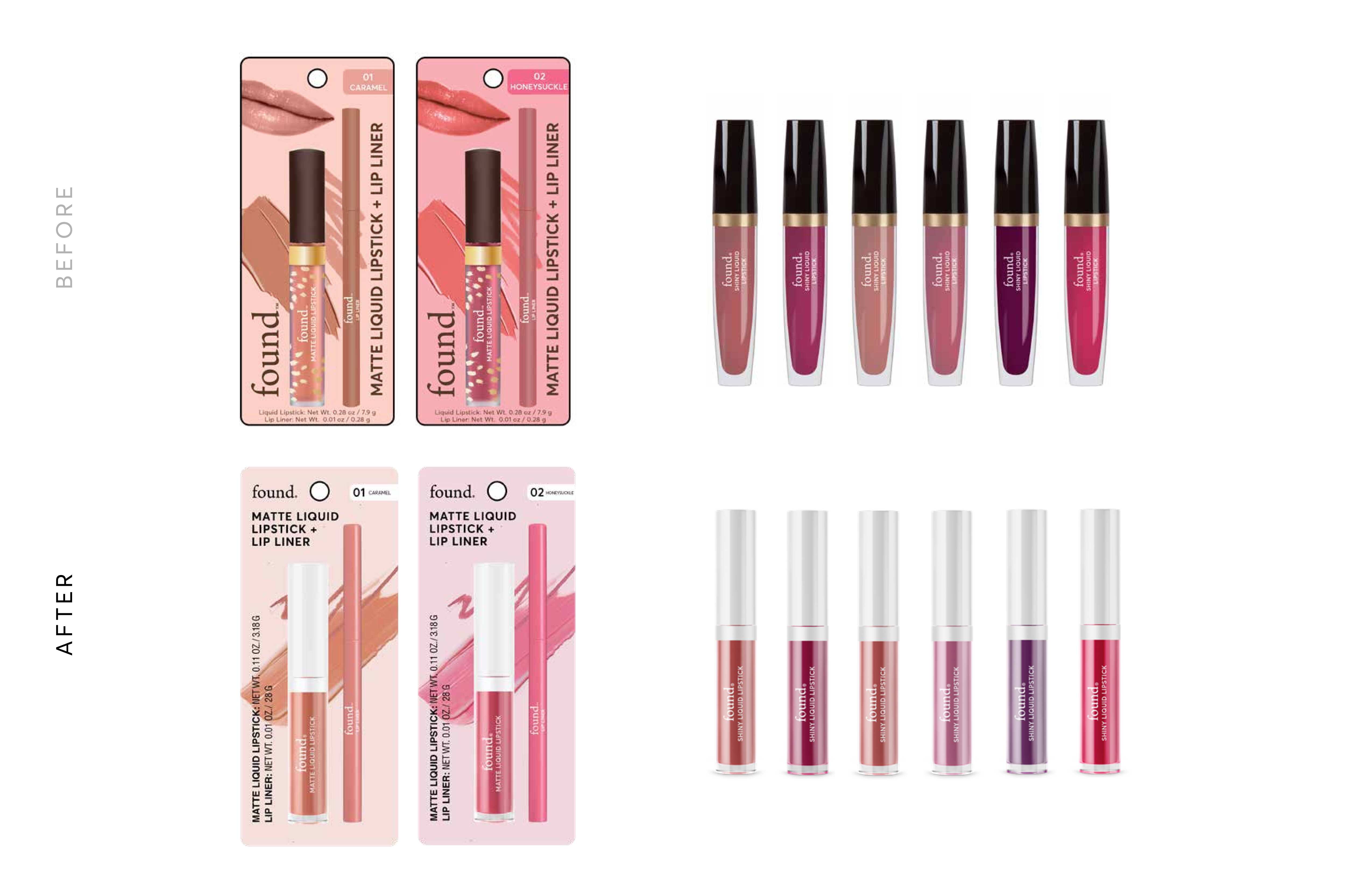
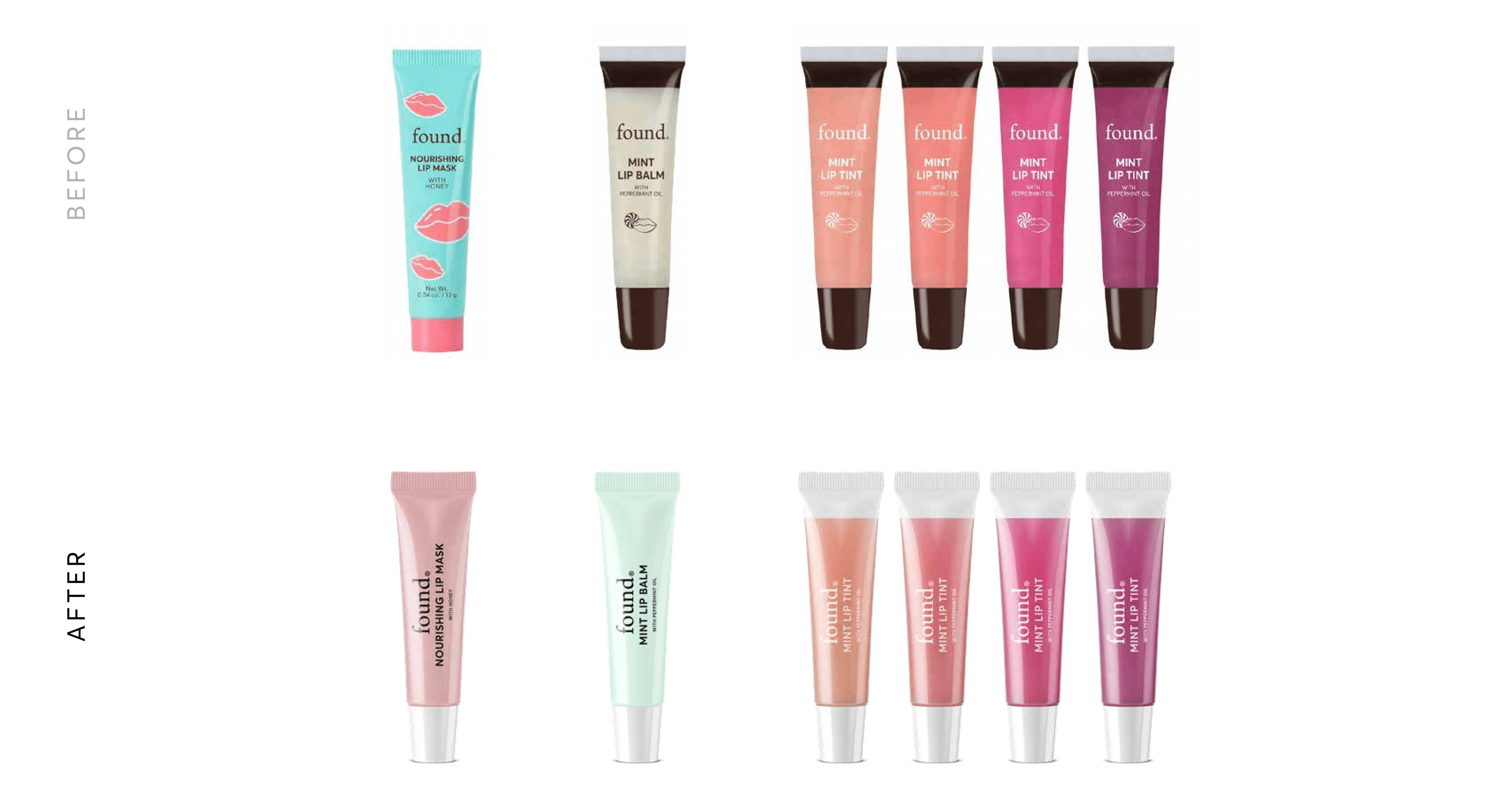
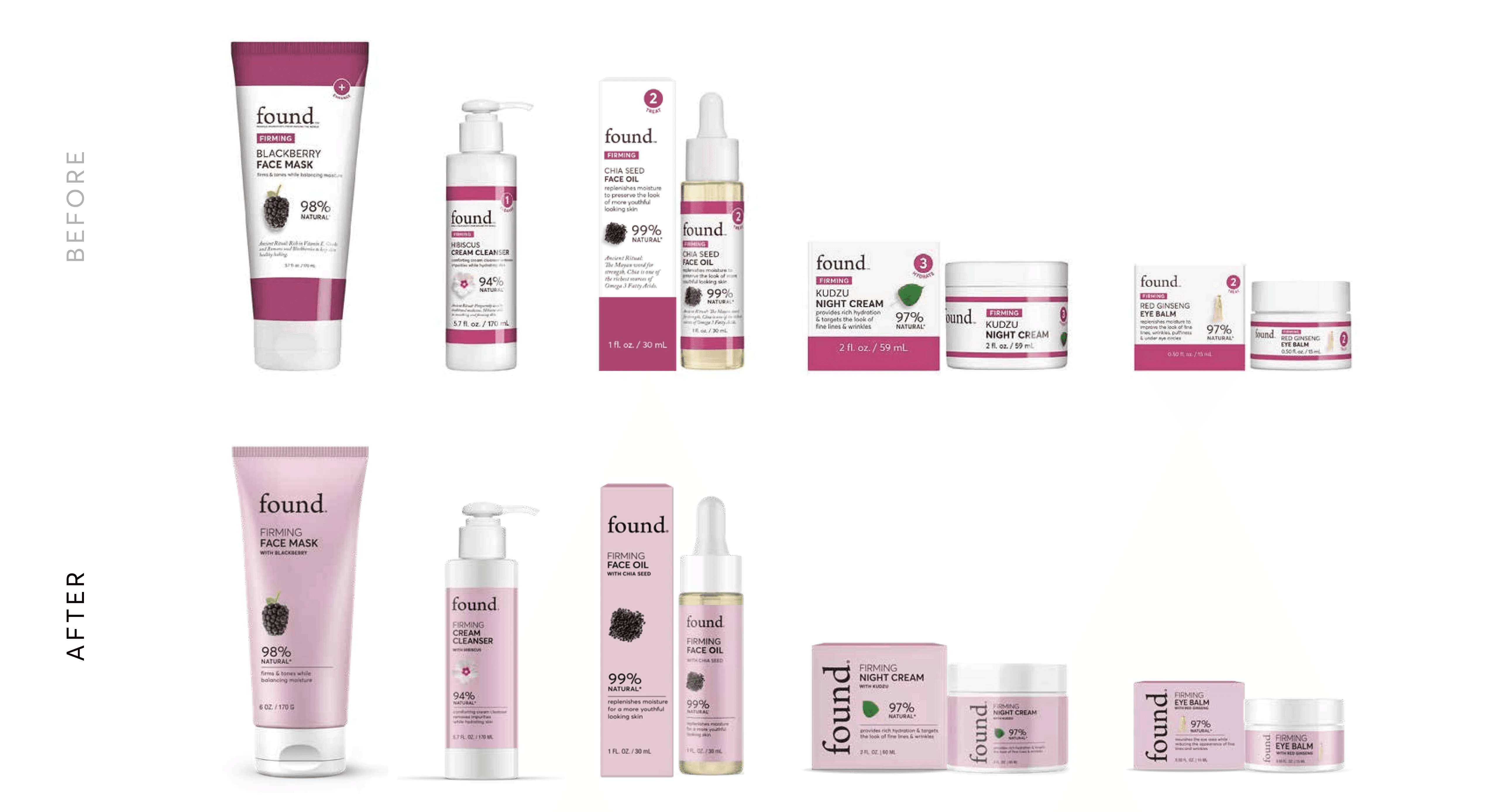
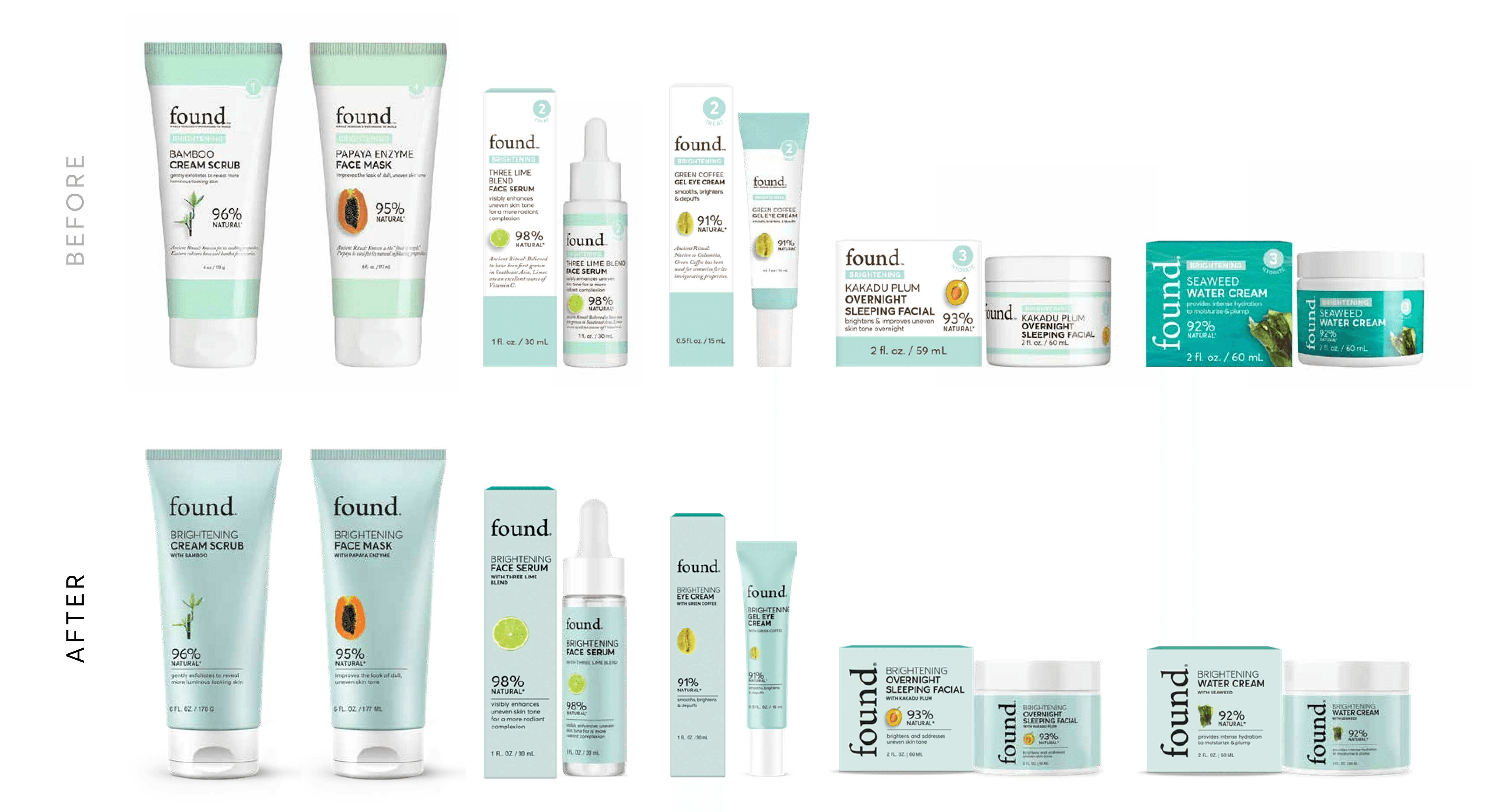
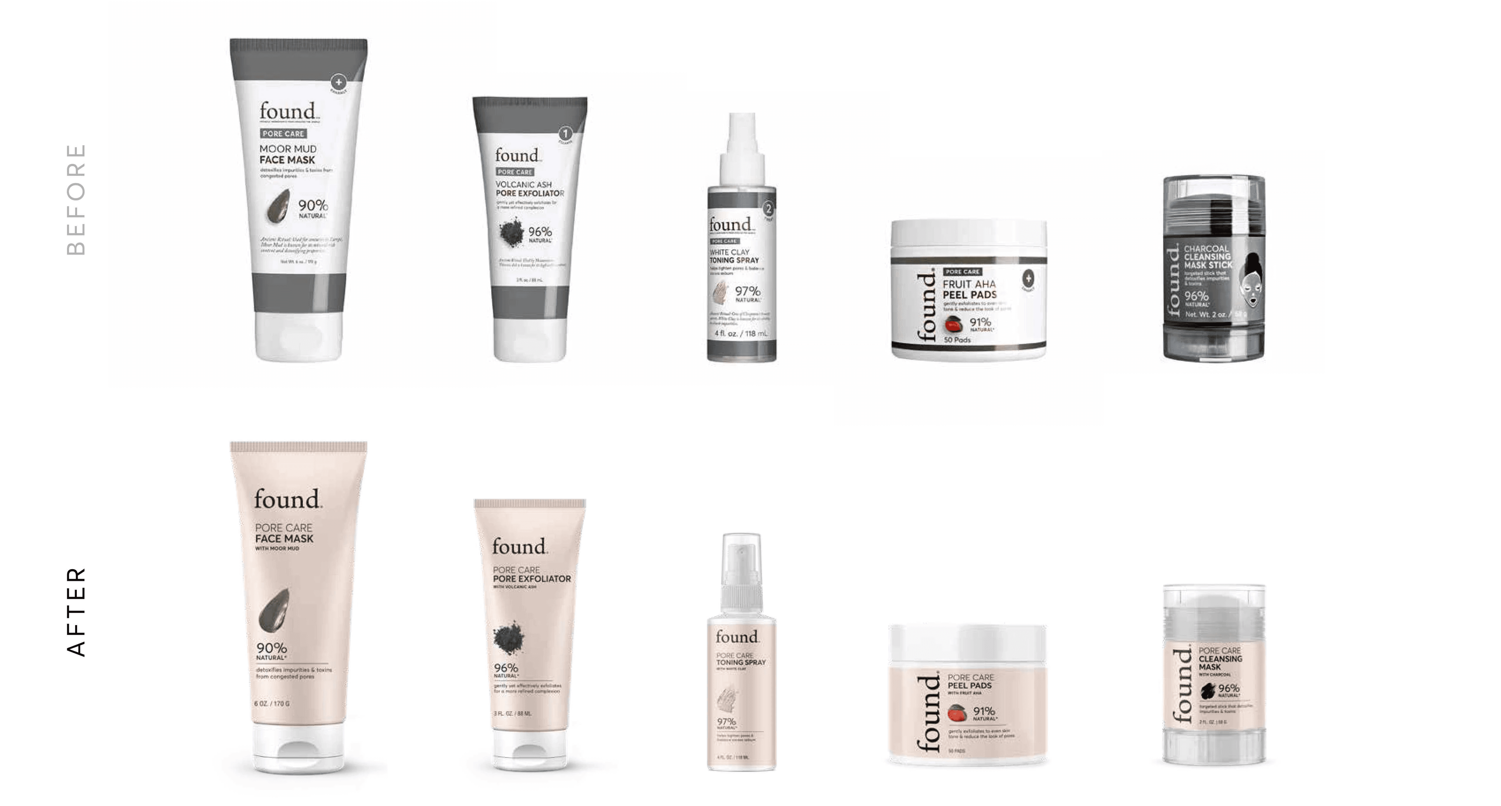
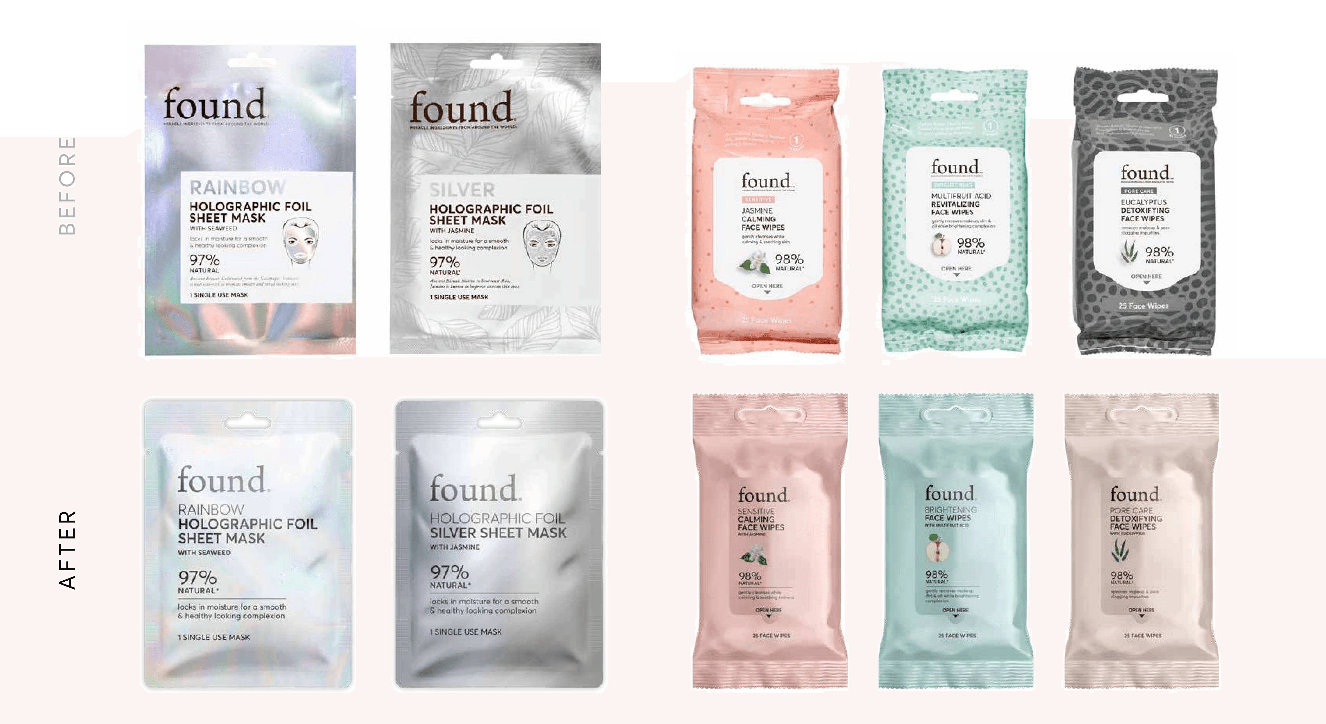
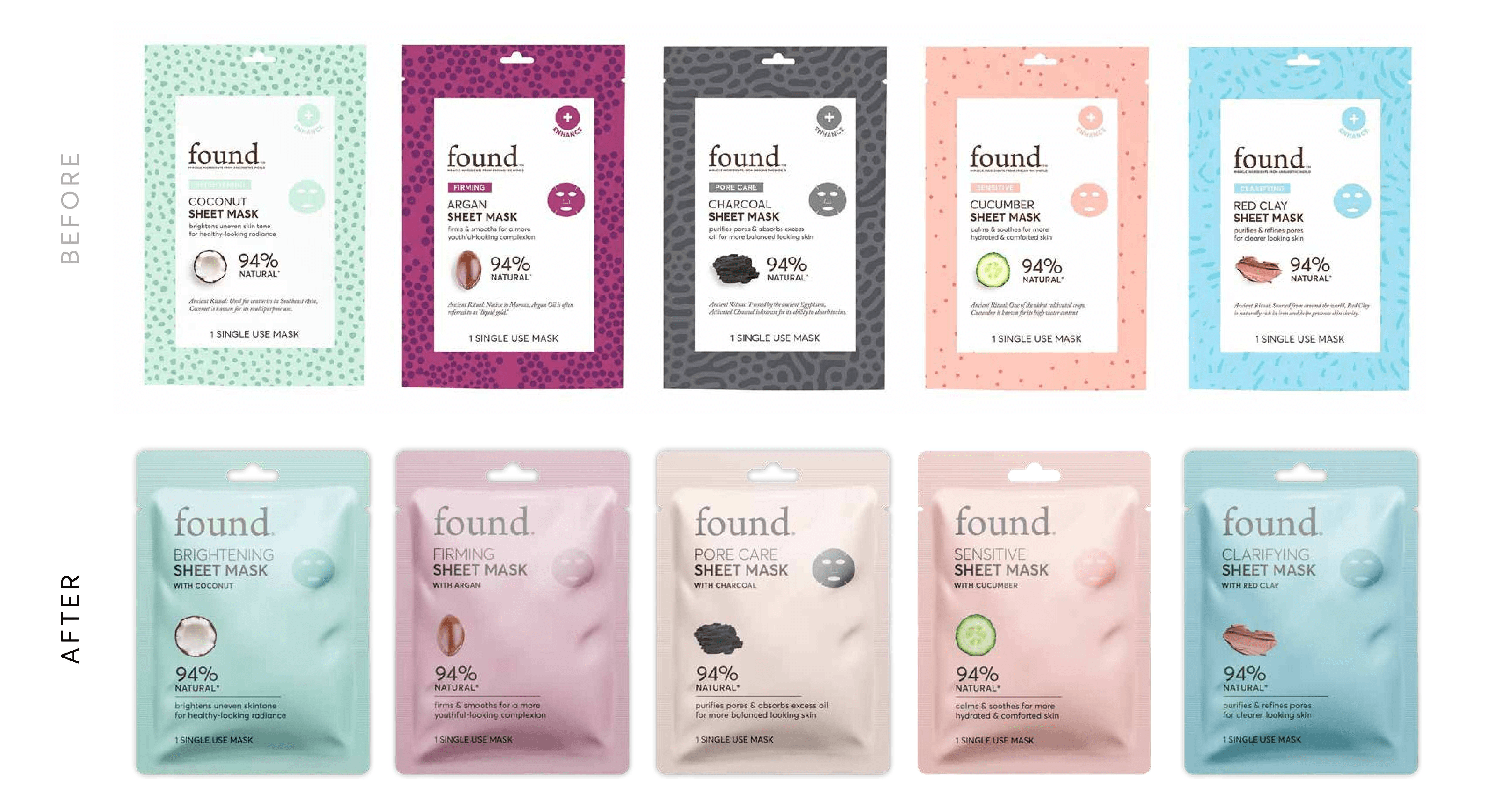
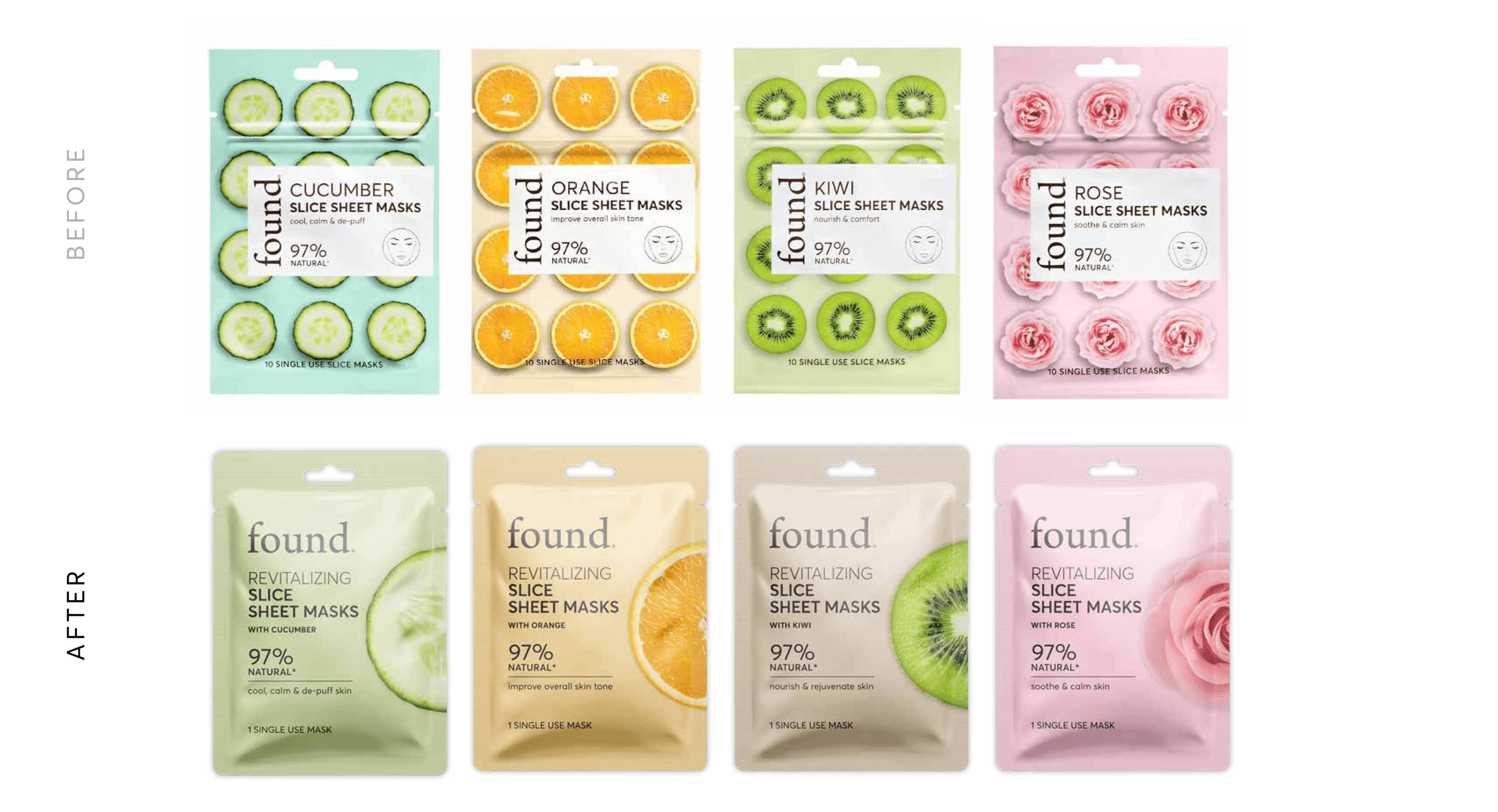
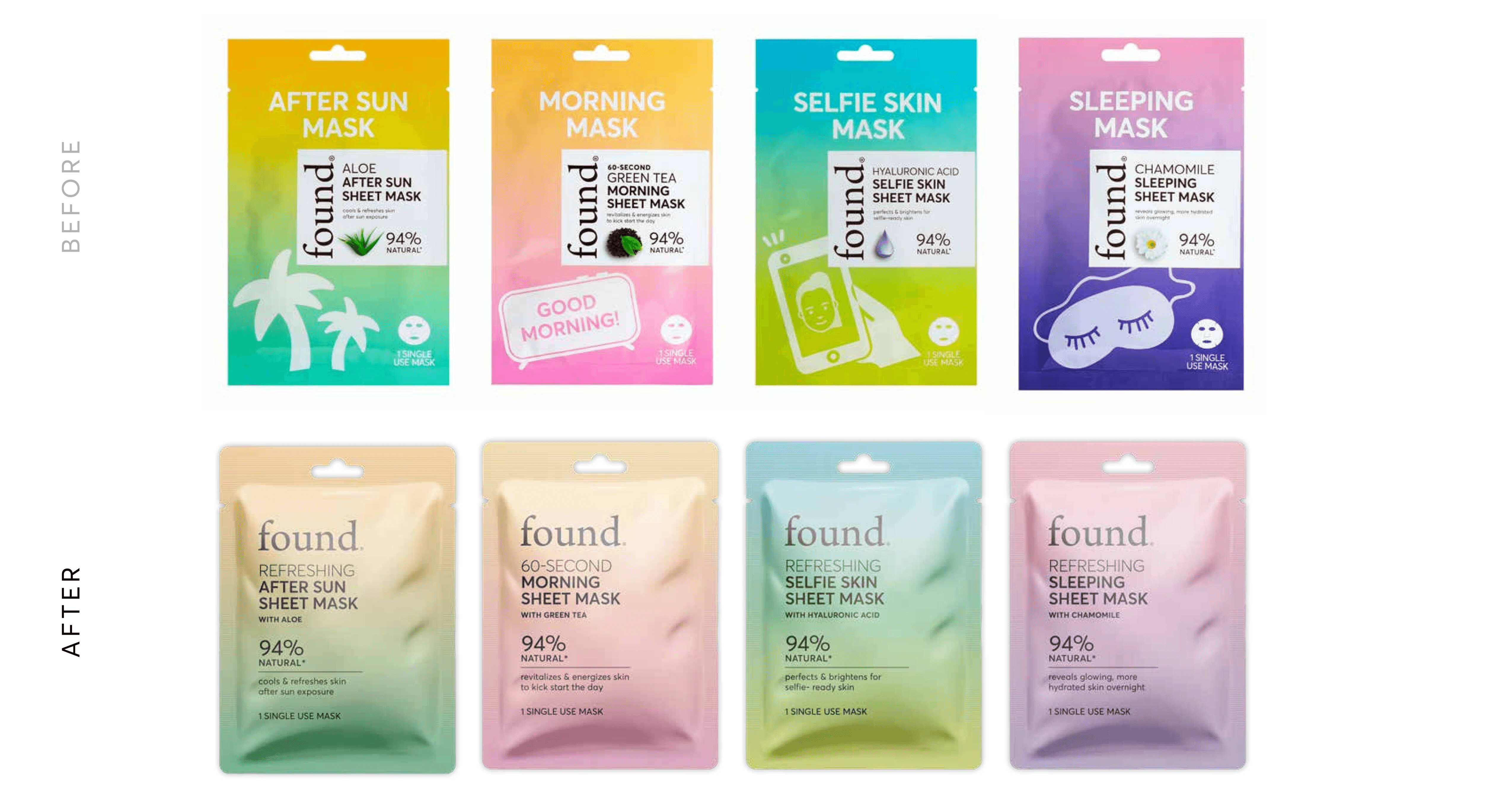
Design Focus
Create a refined packaging direction with clearer hierarchy, simplified layouts, and consistent typography to unify the brand across skincare and cosmetics.


Approach
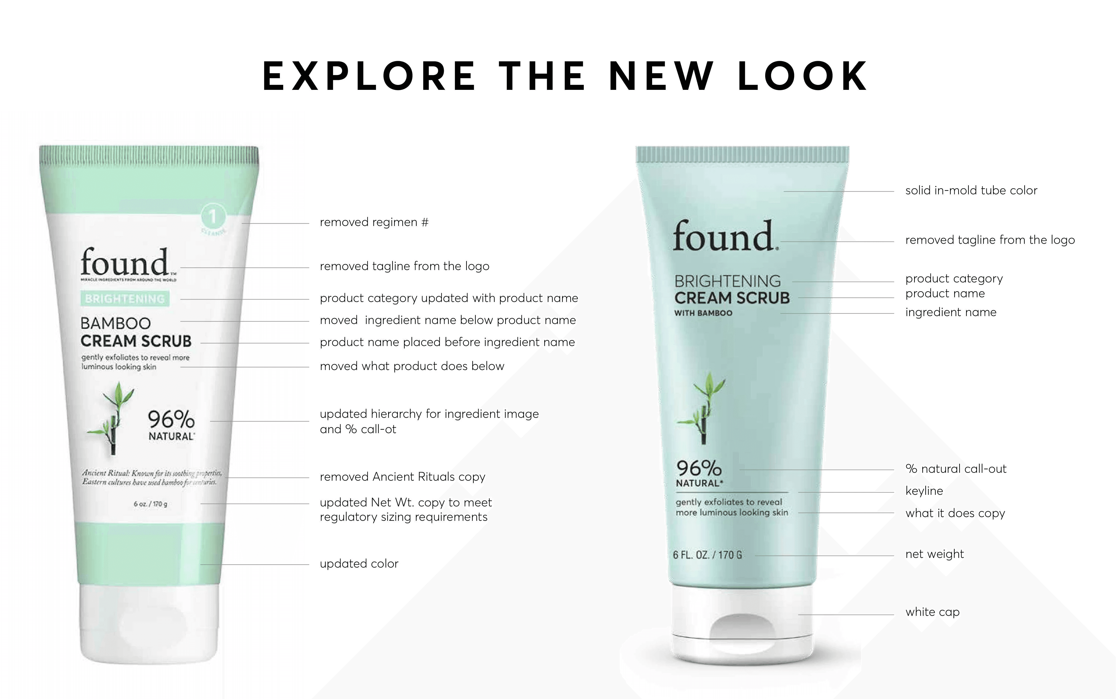
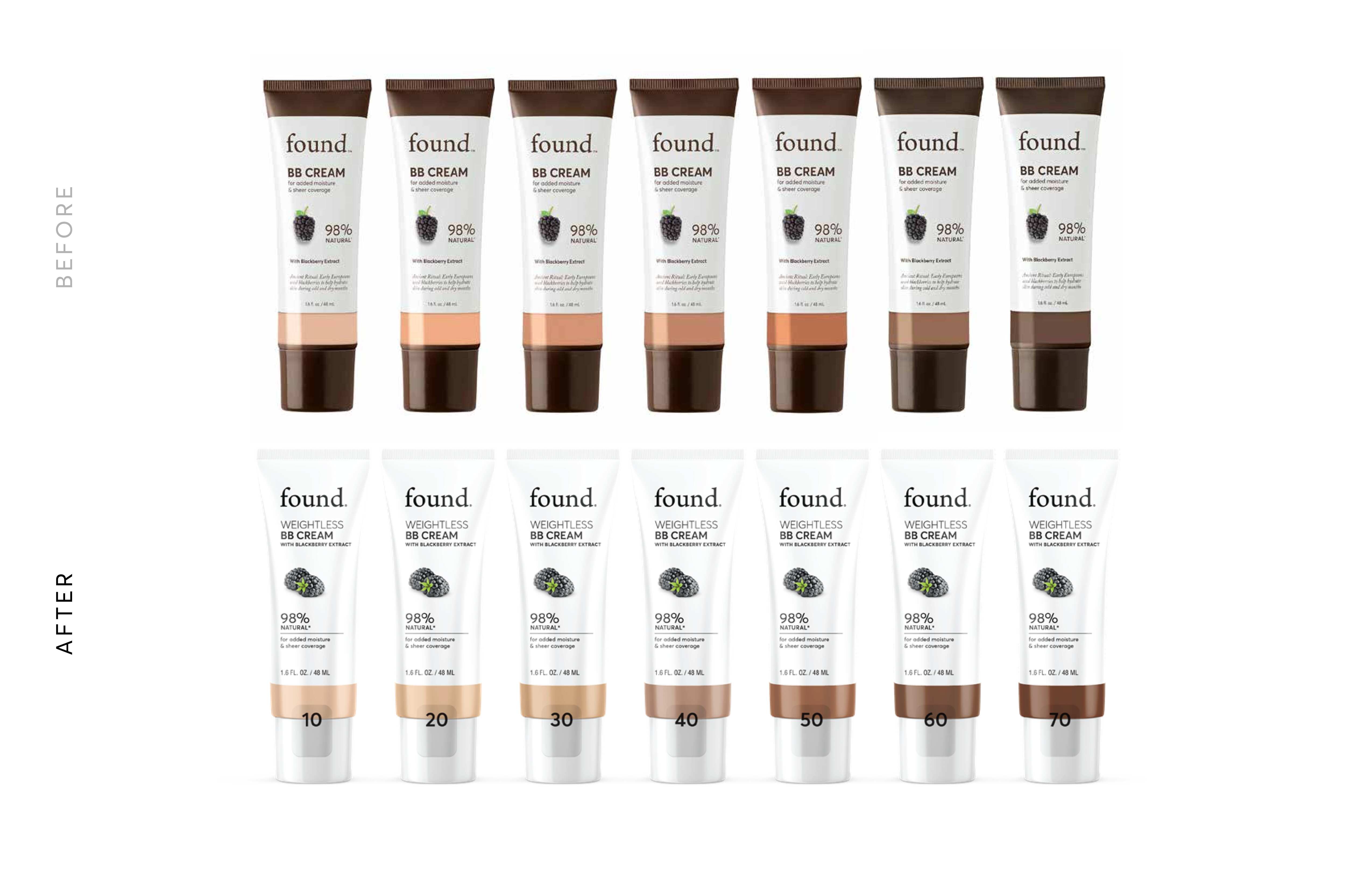
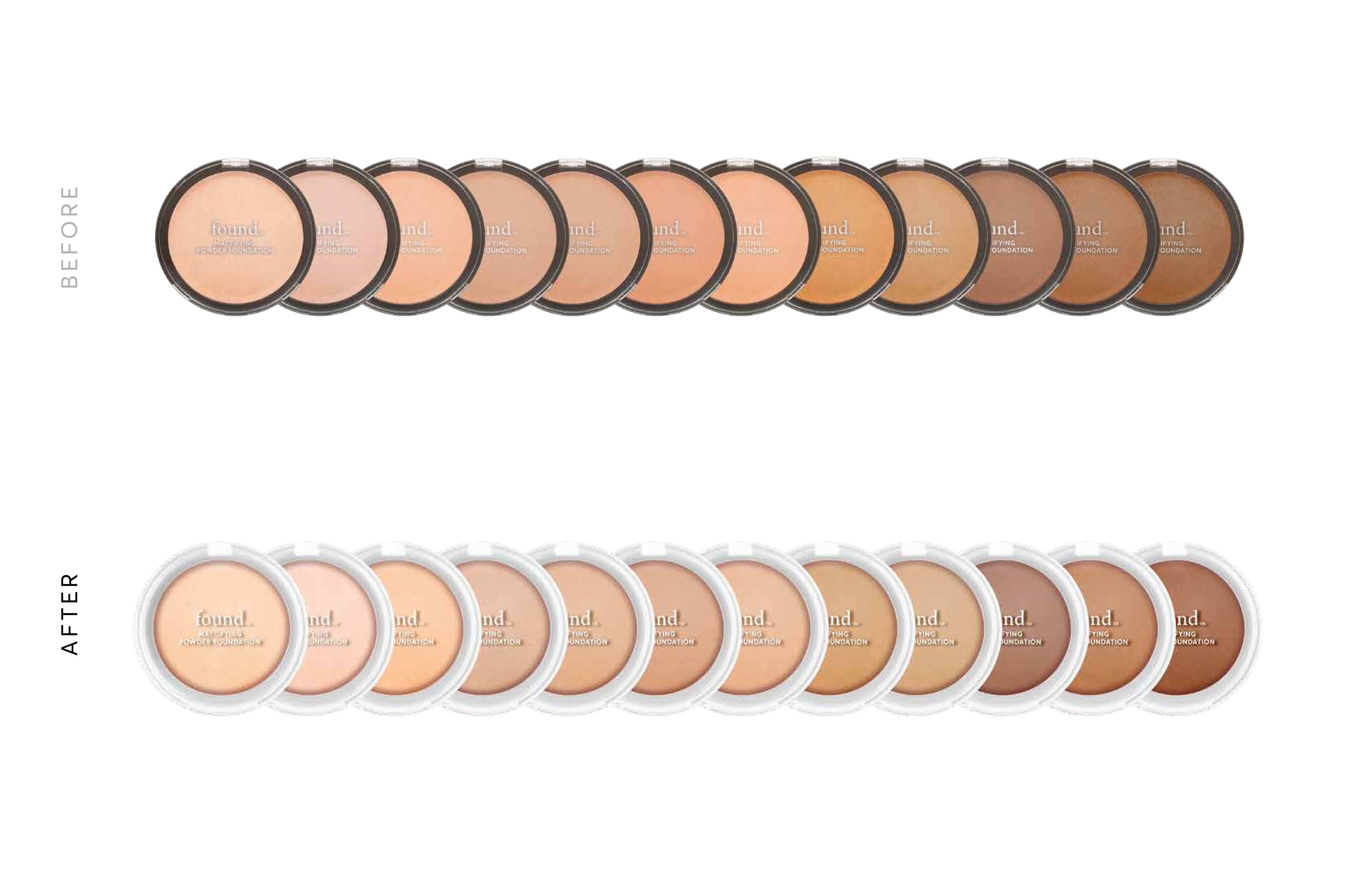
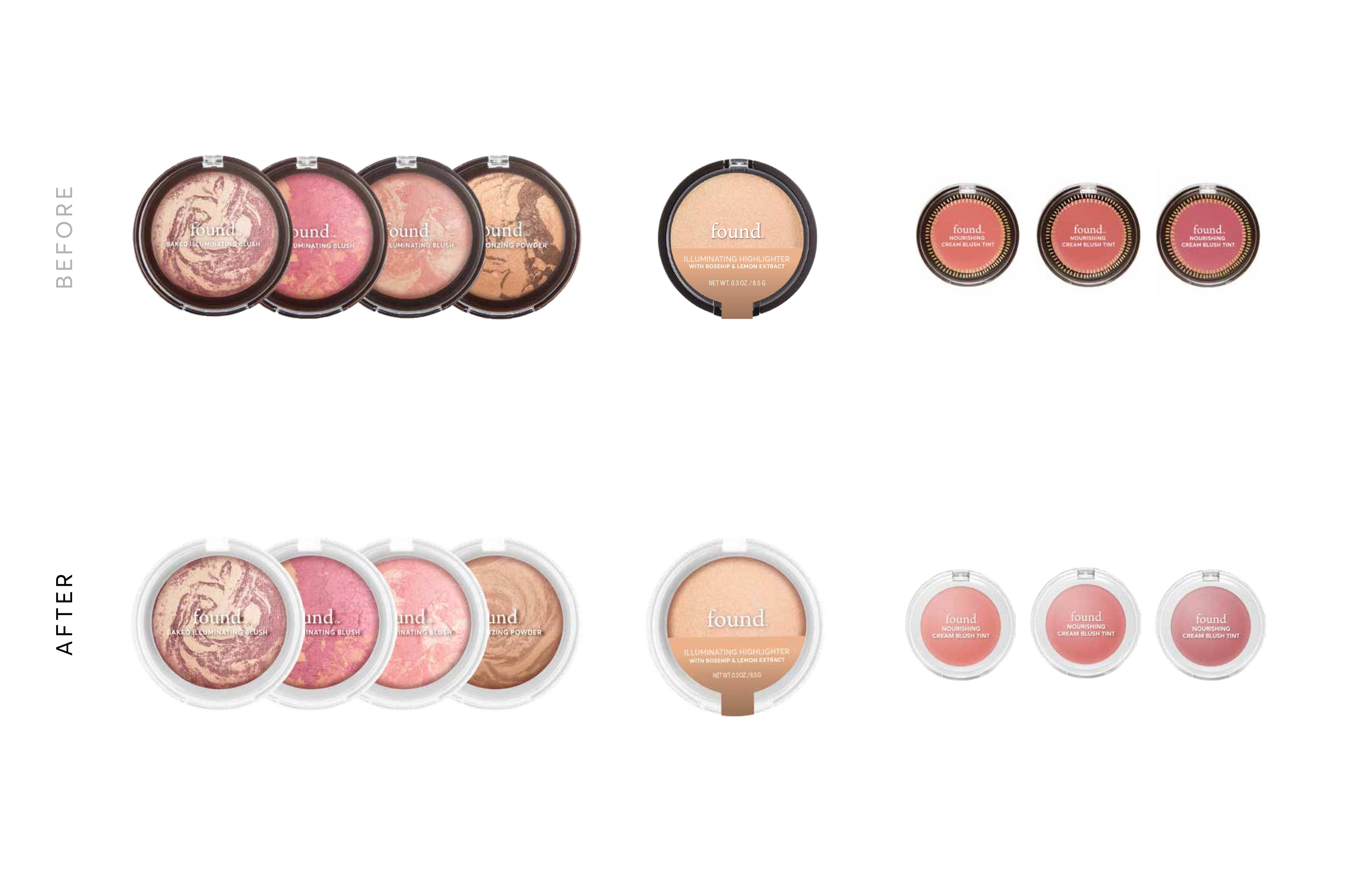
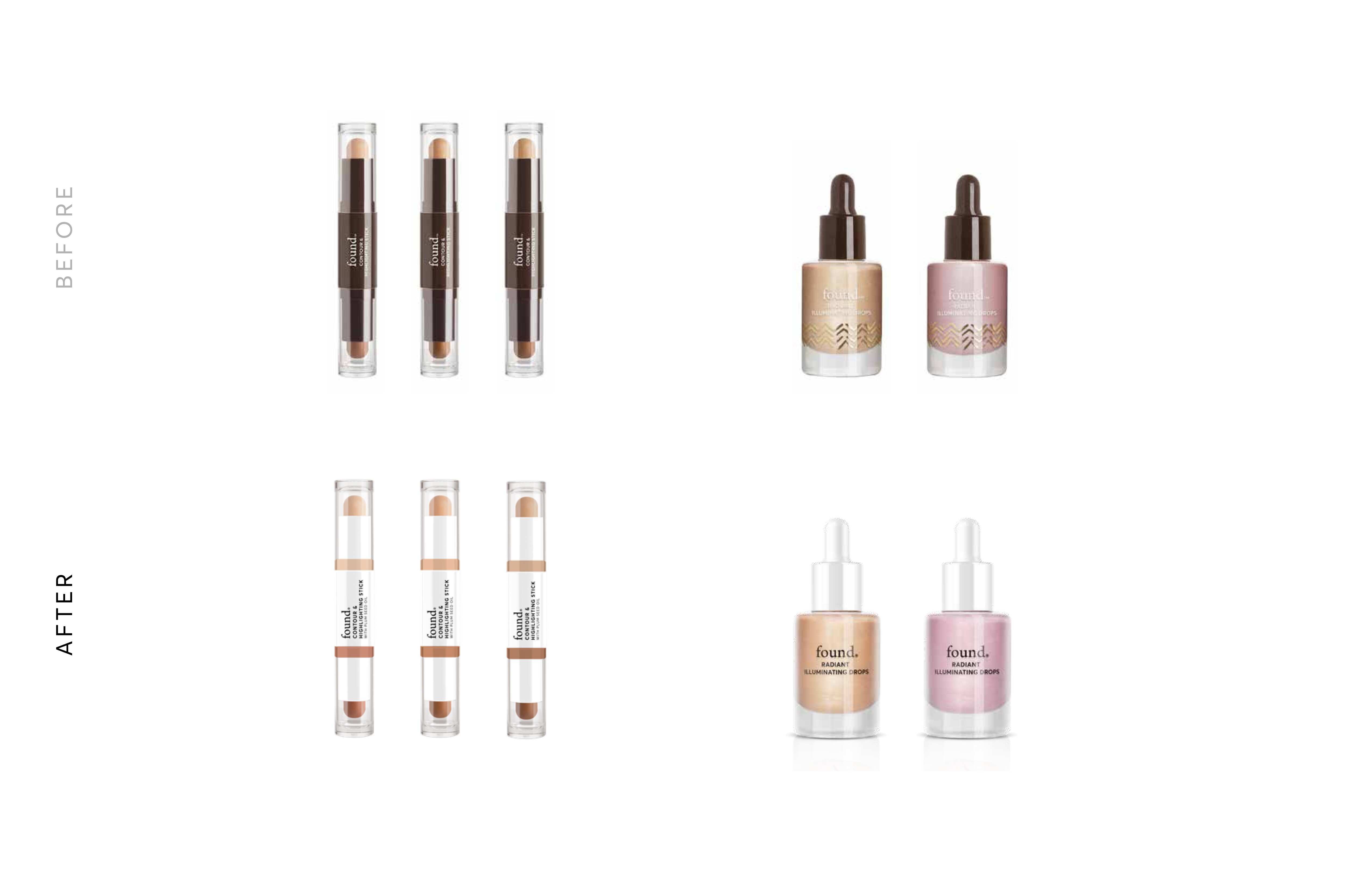
Simplified the visual language and strengthened hierarchy to improve clarity and consistency, with a focus on fast recognition in digital and in-store retail environments.
Solution
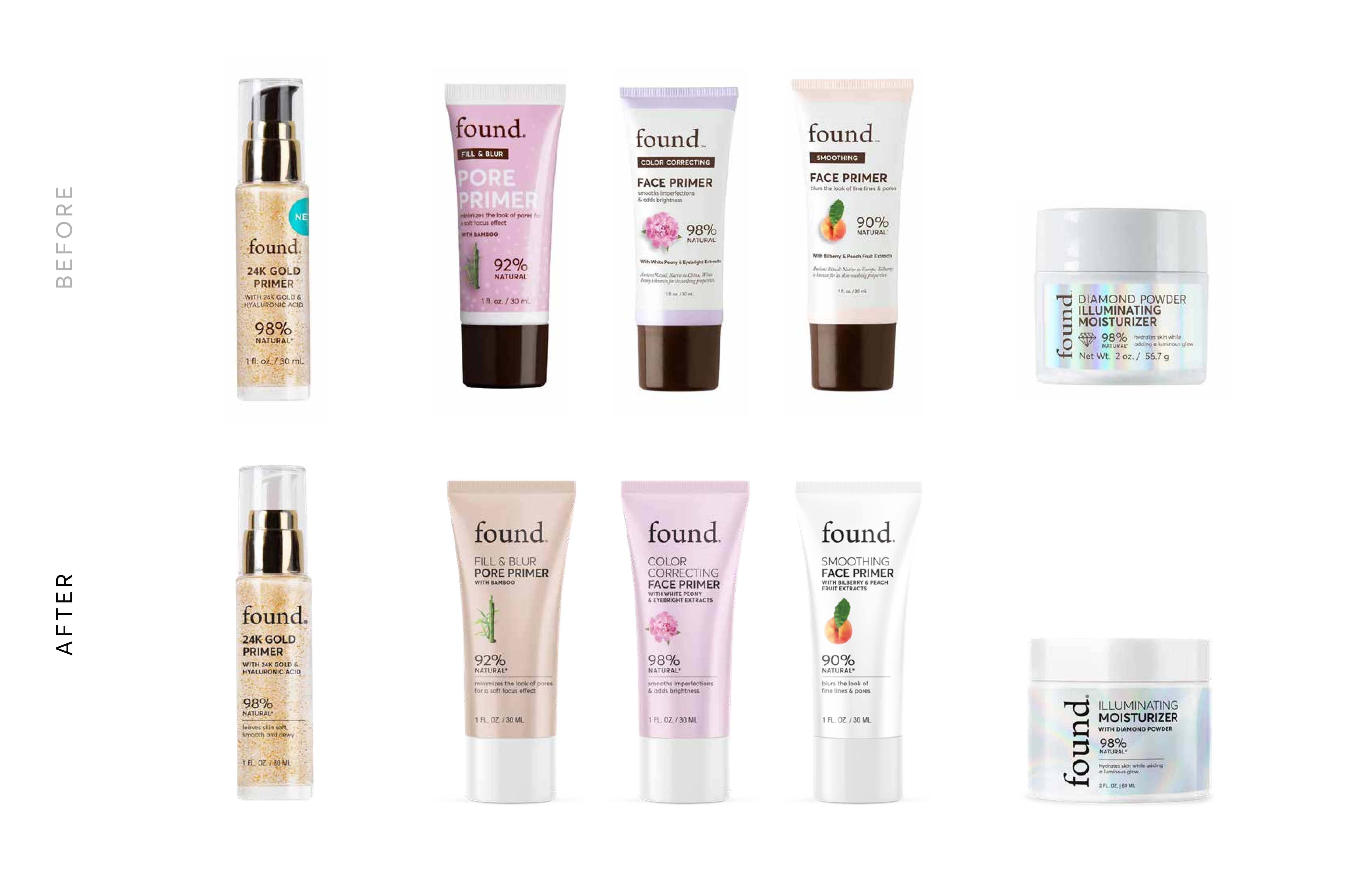
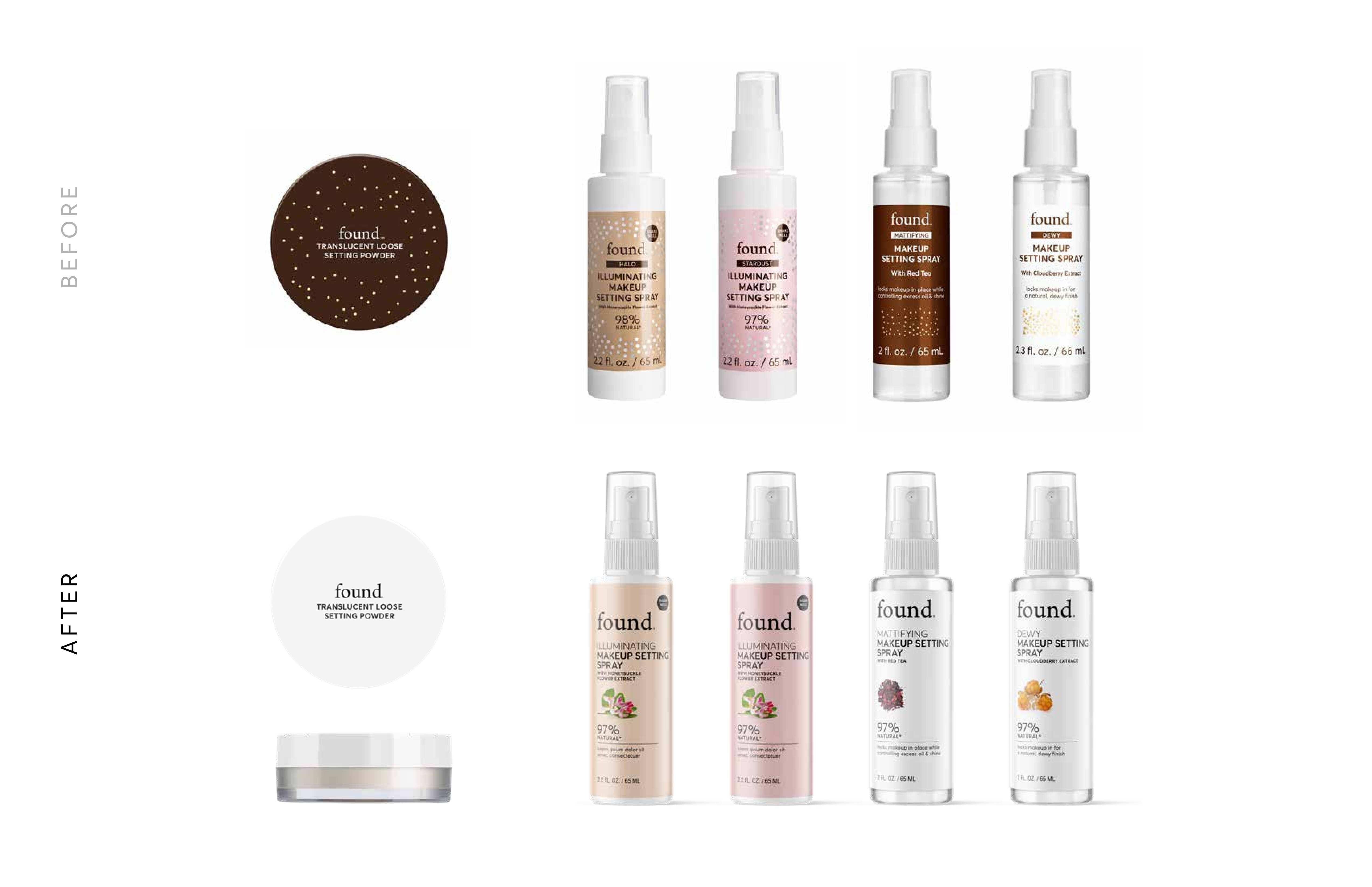
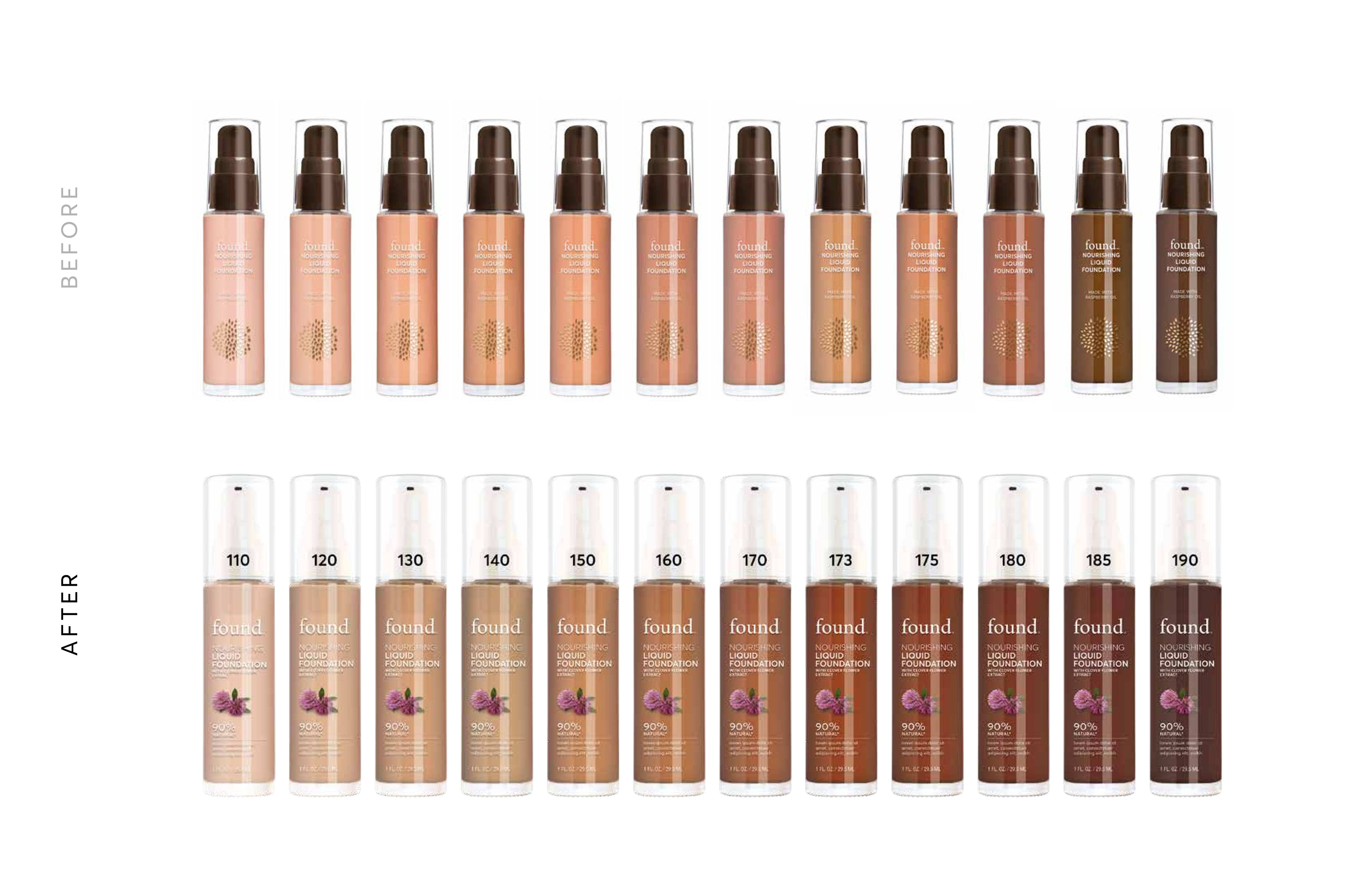
Developed a cleaner, more structured packaging direction with refined typography and clearer category differentiation that scales across the product line.
Outcome
The exploration results in a more cohesive and legible system that strengthens brand recognition and supports future growth across categories.
Final Thoughts
This project highlights how clarity and structure can elevate multi category beauty brands while remaining approachable and flexible.